Oxygen Updater v6 is now promoted to stable (was beta)
v6 is now stable (2023-11-17)
After a total testing period of ~2 months, v6 is now available to everyone! You should automatically receive an update via Play Store, even if you had installed our Patreon & Open Beta builds before. If you don't see anything yet, try clearing Play Store's cache or try again later.
We could have released v6 to stable last month itself (October), but we were waiting primarily for Google to fix a few Jetpack Compose bugs. This also gave more time for our translators to update strings in the app, however no one has made a GitHub Pull Request just yet. We can only assume that machine translations for new & changed strings — via DeepL and Google Translate — are already accurate enough.
Changes compared to v6.0.0-beta.3
- Added support for all of OnePlus Pad's regional variants
- Added support for GDPR ad consent form (shown only to EEA/UK users who haven't purchased the ad-free unlock)
As a reminder, our app is ad-supported because we're just a few people involved in this whole project, and any amount of monetary gains go right back into Oxygen Updater & its team. It helps us pay for server and infrastructure costs, and also motivates us to continue taking out time from our lives to work on this. We hate ads as much as most of you do, but currently there is no other way to support this project long-term. Our Patreon subscribers are a huge help nonetheless. - [update] Fixed rare inconsistent download button states
- [main] Fixed "News" or "Device" app shortcut (via launcher) always opening into the default "Update" screen
- [install guide] Fixed download instructions being shown when they shouldn't
- [news] Toggling between read & unread articles via the banner will now animate each item if its position changes
- [update] Fixed minor text bug related to advanced mode & selected update method
- Simplified code in some areas that should improve general performance, though it may not be noticeable
You might've already gotten the update via Play Store because we had rolled it out yesterday. If not, go ahead and update it now. Email us at [email protected] with any feedback you may have, and we'll be sure to resolve them ASAP. Alternatively, you can also join our Discord server.
Note: a GitHub release will be up soon.
The original article, along with all its previous edits, is preserved below. We highly recommend going through it at your own pace, especially if you're currently on v5.11.3 of our app. We've described all the changes & improvements in v6 in great detail.
v6 Open Beta changelogs
beta.3 (2023-10-08):
- Fixed crashes
- Improved text layout for nav labels, grid items, bottom sheet headers, and appbar subtitle
beta.2 (2023-10-07):
- Fixed news interstitial ad being shown even to users who had purchased the ad-free unlock
beta.3 (2023-10-08):
- Fixed rare crashes: (1) when trying to select text; (2) soon after opening the app
- Improved text layout for nav labels, grid items, bottom sheet headers, and appbar subtitle. All of them are now limited to 1 line, except that if they don't fit, they will automatically "scroll" to reveal the rest of the text (marquee effect).
EDIT 2023-10-06 18:15 IST:
v6 is now available as an Open Beta on Play Store. You'll have to manually enroll in our Play Store page: https://play.google.com/store/apps/details?id=com.arjanvlek.oxygenupdater. There should be a “Join” button under “App support”. Otherwise, it may also be accessible via Play Store > tap on the profile icon (top-right) > Manage apps & devices > Installed > Oxygen Updater > tap on “Join the beta”. You might have to wait a bit for the process to complete. If you don't see anything, close Play Store completely, clear its cache, and try again later.
If you don't have access to your phone at the moment, you can enroll via the web link as well: https://play.google.com/apps/testing/com.arjanvlek.oxygenupdater.
Note to our Patreon subscribers: while you can also enroll in the Open Beta, you don't need to. We will share the same APKs with you on Patreon as well, which you can download & install at your convenience. Eventually, after the public testing period is over, we will promote v6 to stable, and then everyone will be able to install v6 without needing to perform the manual steps described above. It will be delivered as a regular Play Store app update (assuming you've kept "auto-update" enabled for our app).
The last Patreon-only version we shared with our subscribers was v6.0.0-patreon.3. The first Open Beta build is named v6.0.0-beta.1, and subsequent builds (if any) will increment the last digit (e.g. v6.0.0-beta.2). Stable release will be named v6.0.0 to start with.
Changes compared to v6.0.0-patreon.3
In the “What's changed in v6” section below (of the original article), we noted that v6 had finally unlocked screen orientation so that you could use it in landscape, floating window, foldable phones, tablets, etc, but that the UI (at the time) was not yet specially designed for those screens. The main focus for Open Beta was to support large screen formats in the most commonly used app screens, but we've also fixed a crash-on-download bug that affected only Android 14 devices, and generally improved performance.
Most apps display their content only in portrait, because that's the most common orientation for phones: limited width to work with, but quite a lot of height relatively speaking. In landscape though, this is flipped: we have limited height, so we can't put content the same way we did in portrait. It forces us to rethink how we lay out the UI in our app. The way we've implemented it is quite a simple idea: split the screen into two parts, thus allowing us to not waste any space by laying out our content side-by-side.
This makes sure you don't need to put any extra effort to view the full UI — everything is right there, no extra scrolling required. The idea scales quite well to foldables, tablets, and desktops too. The following screenshots are examples of how our UI looks like on a landscape phone (OnePlus 8T). In some cases we've also put screenshots of tablet/foldable devices taken on an emulator.
Note: portrait screenshots for each screen are part of the original article towards the end. Scroll down if you'd like to quickly compare landscape & portrait.
Onboarding/first-launch screen
We've put important actionable items are on the left, because in most languages we read left-to-right (except Arabic, Hebrew, etc). Right side has accompanying text that's not crucial to understand, but still nice to know. In portrait all this is laid out vertically one after another.
Update screen
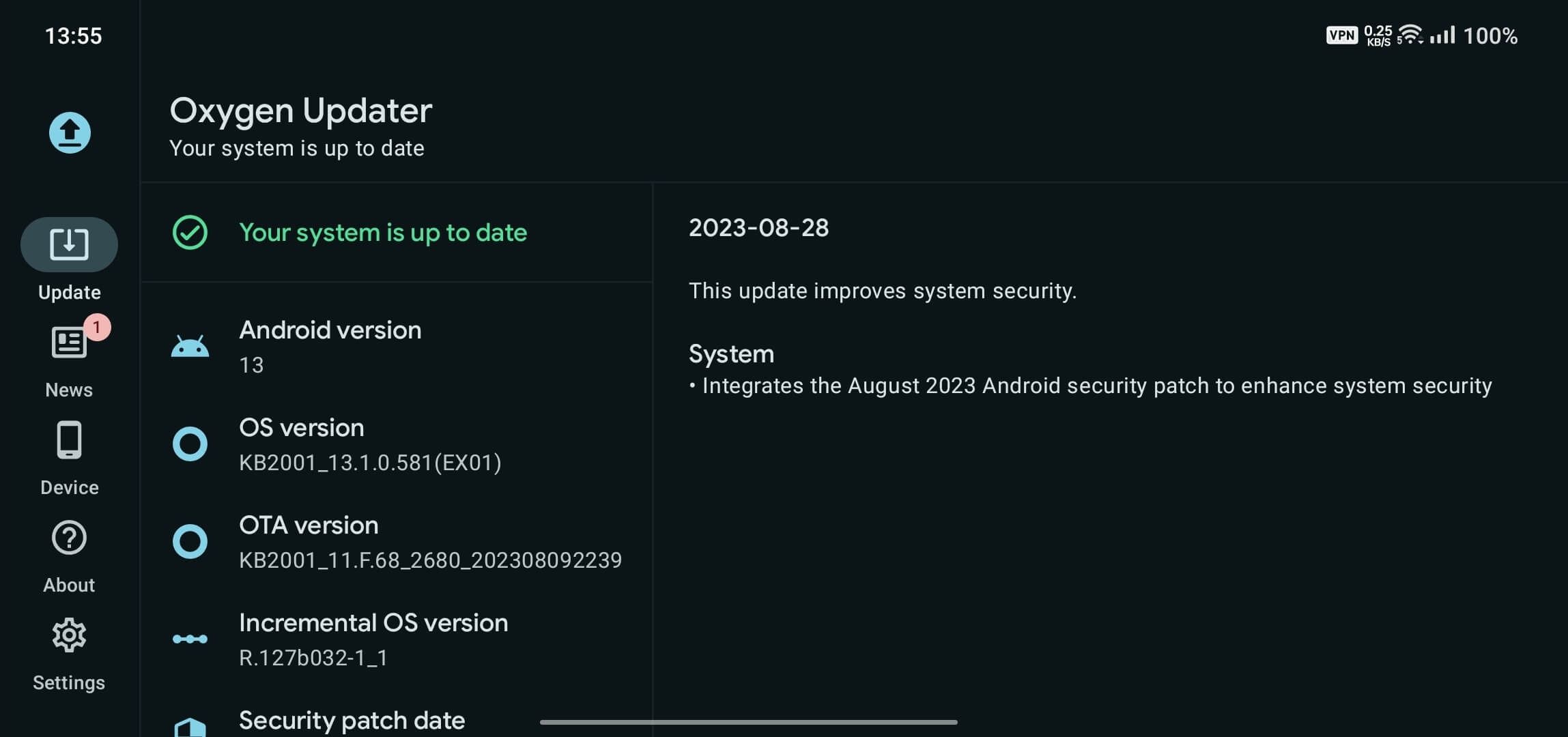
In portrait we first show software information, and changelog follows after (it's initially hidden behind an expandable section). As you can imagine, if we stuck to the portrait layout even in landscape, you'd need to scroll a lot just to see changelog. We've continued the earlier splitting-up idea here too: software information is on the left, and changelog of your current OS version is on the right, thus you have access to important information immediately, no extra effort required. And of course, both sides are scrollable.
You may have also noticed something else is now on the left. Earlier, the main screen of the app showed our top-level navigation destinations in a bottom navigation bar. That has good ergonomics for portrait, as it allows easy one-handed use. However, for landscape & larger screens, it's a bad choice as it leaves less space for actual content. When in landscape orientations, most people hold their devices with both hands, so we decided to move these items to the side, via a new Material 3 side rail component. This takes advantage of the greater horizontal space, and allows you to use your left hand to change destinations and your right to scroll through the UI.
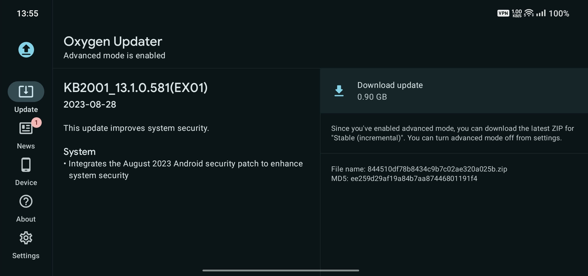
This is the screen you'd see if there was a new update available for your device. We have enabled advanced mode only for example purposes, as at the time of taking the screenshot my 8T was already on the latest version. It should be obvious how & why this UI is great for landscape: both sides of the screen are important, but distinct and thus they've been grouped with that in mind. Coincidentally, this also solves an issue with the portrait layout: if changelog was long enough, the accompanying text on the right (advanced mode reminder, filename/MD5, etc.) would be pushed down and you'd need to scroll to see it. In landscape, it's visible immediately.
News grid screen
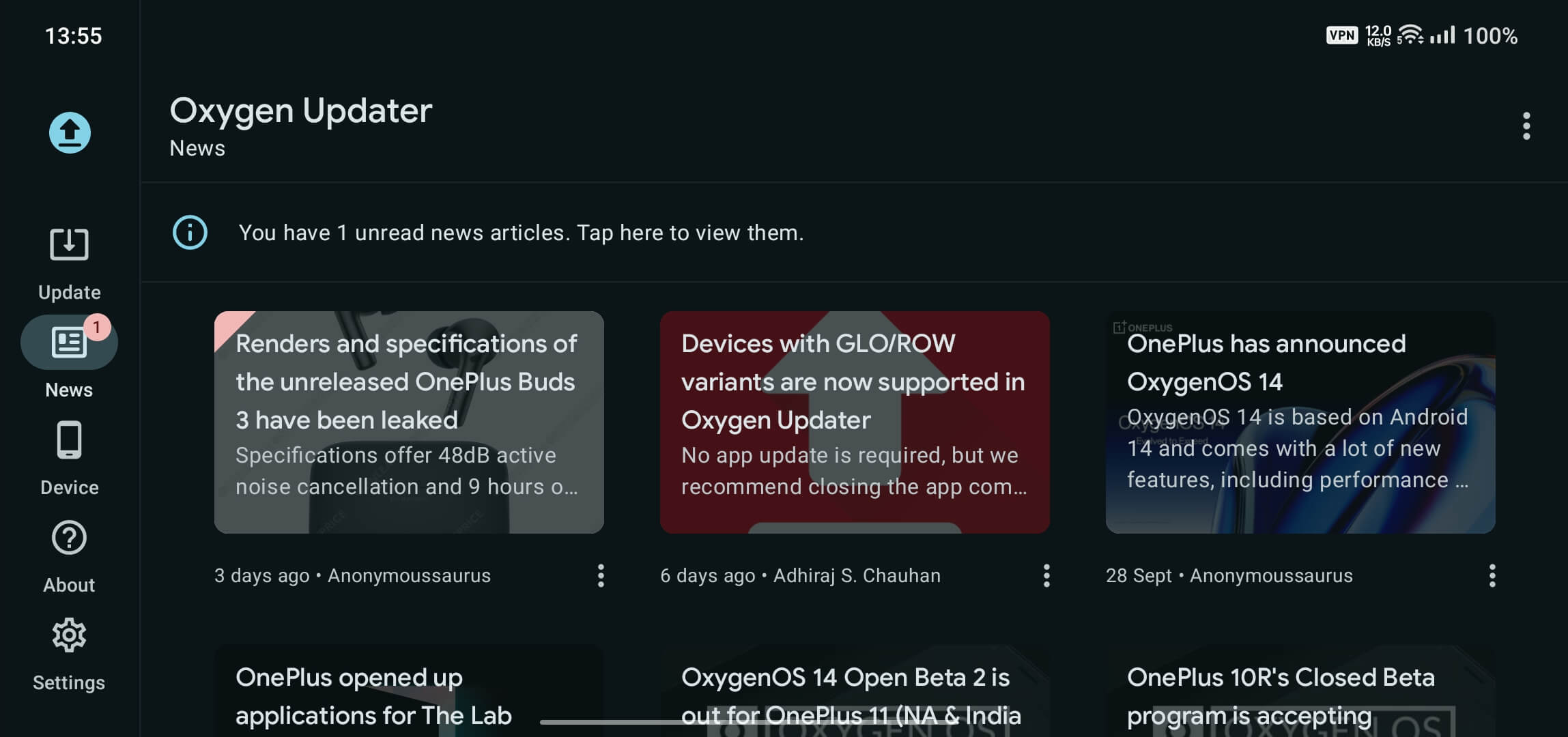
In portrait, we displayed a list of all our articles, arranged in most-recent order. If we kept that layout even in larger screens, the UI would look a bit ridiculous, as if we stretched everything to fit the entire space. It would also implicitly require more cognitive effort from you, if you needed to read the entire text (your eyes would need to travel across the entire screen). So for larger screens, we decided to arrange our articles in a grid instead.
This is the only screen where the UI is completely different compared to portrait, and we hope you like it. The grid size adapts to screen size; e.g. on tablets and foldables, we show more items per row, and each item is larger to take advantage of available screen space as efficiently as possible.
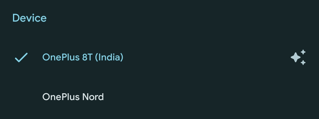
Device screen
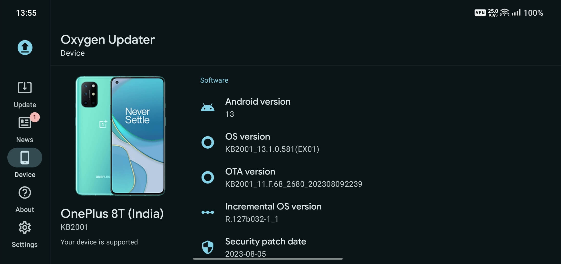
Your device image, name, model number, support status, and any other important text is displayed on the left, while software information is on the right. Again, both sides can be scrolled if needed.
We're very happy that we could add such important features without bloating up the app. All these new features have added only 3 KB to the app's full APK size (v6.0.0-patreon.3 was 5.84 MB; v6.0.0-beta.1 is 5.87 MB), and download/update size remains the same:

Another thing worth mentioning: we've put special emphasis on making the transition between different orientations as seamless as possible. Try it out yourself! Turn on your device's auto-rotate feature and see how the app switches between both types of layouts without any hitches or redraws. We will see if we can add some subtle morph-transitions as well, to make it look and feel "alive".
The original article was titled “Early Access: Oxygen Updater v6.0.0 available on Patreon”, published on 21st September 2023. Its contents are preserved below. You can go through it if you haven't already, as it contains a lot of details about its development, including screenshot & video comparisons with v5.
Some parts of this article may be familiar to our Patreon subscribers, because as a reward for their financial contributions to the project, we gave them access to v6.0.0 before anyone else.
Based on feedback from our patrons (read: Patreon subscribers), we will open this to everyone via a Play Store Open Beta, and then eventually there will be a stable release. We'll notify you again in both cases, but if you want to try v6.0.0 now, please consider becoming a patron if you like what this article describes. It will also help motivate us to do similar exciting work in the future.
This is the longest article we've ever written, and we've done it only for your benefit. It's full of details and comparisons, so hopefully it's not a tough read. If you are interested & excited about v6, we recommend going through this article one section at a time. Also, it may be a good idea to read this on a large screen (desktop, tablet, etc.), as phone screens aren't well-suited for information-dense content.
Background story
We've been hard at work at fully rewriting the app's code into Jetpack Compose, which is a new UI development toolkit for Android (although it can be used for other platforms too). When it launched all the way back in 2019, it promised faster, simplified development and tried to lure iOS & Web developers over to Android (its declarative style is similar to what they're already familiar with).
However, at the time it was rough, filled with performance issues, and came with a general uncertainty of what it could end up to be. It got its first "stable" 1.0 release in July 2021, two years after it was first announced, but it still wasn't good enough. It had all the basic stuff a new developer might come to expect, but spend any more time with it and you'd quickly realise there's many things missing.
That's why we never fully committed to switching over to Jetpack Compose until this year (2023), even though we've been thinking about it constantly. I started development in March 2022, with the expectation that it would take a couple of months to finish everything up. I even showed interest in getting in more people outside Oxygen Updater to help with this refactoring. Most people either never worked with JC before, or weren't yet comfortable enough with it.
I quickly realised that even in 2022, JC was not mature enough for me to dedicate so much effort at that time. There were still crucial things missing, not to mention all the performance issues. Until the start of this year (2023), I mostly just fiddled around here and there, often dropping development for several months.
We touched upon this in our annual "Oxygen Updater in 2023" New Year's article. That was back in January, and it's September now. It wasn't the full 8 months that I worked on it, most of the work happened July onwards. Same reasons as before: JC is still a work-in-progress library in my opinion. Look at the long list of pending things in the official roadmap. Hell, even common things like swipe to refresh, scrollbars, and rich text are "in focus", i.e. not implemented as a first-party solution yet.
I had to write a lot of custom code to get things working to a reasonable degree. I'm happy with it, and I believe so is the rest of the team. With the background story out of the way, it's time to leave negativity out of the next section. I'm genuinely happy with the opportunities JC provides, and how easy it makes adding new features or adjusting existing ones.
What has changed in v6
Most notably:
- Refreshed the app's existing design with excellent Material 3 elements
- Material You/Monet integration: the entire app — even the icon — adapt to your device wallpaper on Android 12+, giving a homogenous feel with the rest of the system
- Themed app icon can be seen only on Android 13+, and on a launcher that supports this feature. The stock OnePlus launcher, for example, requires you to enable this in Settings > Wallpapers & style > Icons, tap on Custom, then enable Adopt system icons.
- Here's an example of what it looks like (left: previous app icon; right: new v6 themed icon):

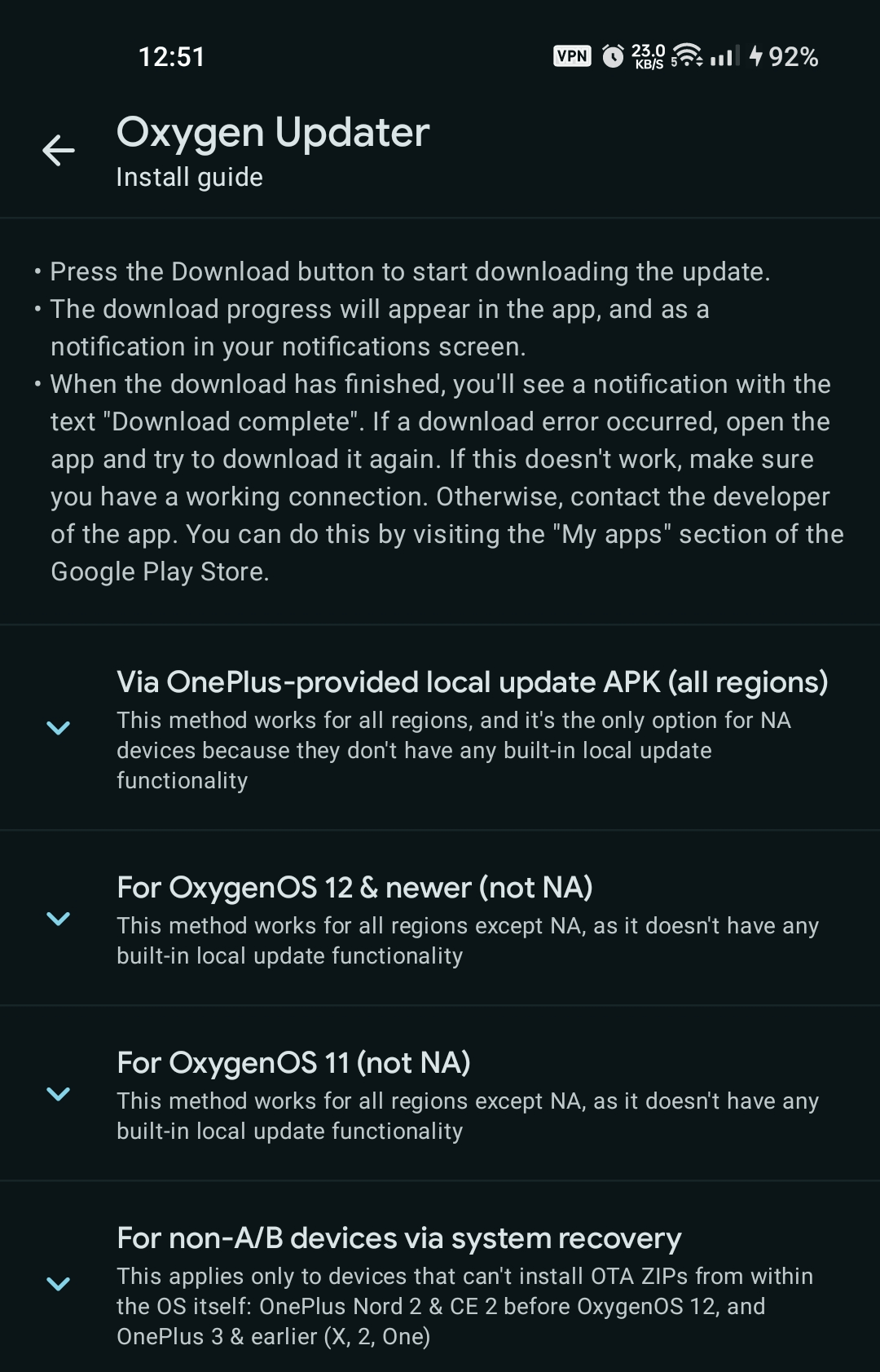
- Revamped our install guides: far simpler to navigate and much easier to understand
- Though design changes are the most obvious ones, this is arguably the most important improvement we've made.
- Earlier, our guides were 4 pages arranged conceptually as "steps" that users had to swipe through.
- This wasted a lot of time, and since the content in these pages was mostly static, it had outdated information.
- We've replaced that with a much simpler UI: everything is in 1 screen, and subdivided into logical groups, e.g. based on OS version/region.
- Currently, they're available only in English and Dutch, but with time (and your help) this will improve even further.
- This ideology has been applied to our onboarding/first-launch UI as well: swipeable pages have been replaced with just 1 screen. No clutter, just quick entry into the app.
- Unlocked app orientation: you can finally use the app however you want; not just portrait but landscape too, or even in a floating window!
- This is especially useful for tablets, foldables, and desktop environments, although the UI hasn't been specially designed for those screens yet.
- Our app has had an in-app language picker since v5.1.0, but now we've integrated with per-app languages on Android 13+
- Funnily enough, OxygenOS 13 does not expose this screen in system settings, even though it's supposed to. OOS 14 has this properly visible to the user; in any case this feature will work on Android 13+.
- Full APK size is now merely 5.84 MB!
- This is a reduction of ~18% when compared to v5.11.3
- Play Store download sizes should be around 4.8 MB, which would be even lower for updates
- Our app has always been boasting small sizes (e.g. v5.11.3 was 7.15 MB), but now we're truly proud of it. This is the first time we've reduced the size despite bringing so many new features & improvements.
- This takes us back to sizes from 2020 (3 years ago!): v3.8.0 weighed in at 5.67 MB, and there have been 34 releases since then, each with their own set of new features/translations/improvements/bug fixes.
- Install size reduced by ~45% when compared to v5.11.3
- In most environments — Android, iOS, desktop, etc. — download size is only half the answer.
- We're extremely happy with improvements on that front too! On my OnePlus 8T, v5.11.3 takes up 16.4 MB when unpacked on install, while v6.0.0 uses only 9 MB.
Other improvements:
- Update screen (1st bottom bar icon)
- A placeholder "loading" UI is now shown when the app fetches data from our servers.
- Previously, such placeholder behaviour was implemented only in the News screen (2nd bottom bar icon).
- Additionally, when possible, important info like device software information stays visible even when loading.
- Removed useless Last checked on string, which always showed "0 sec. ago".
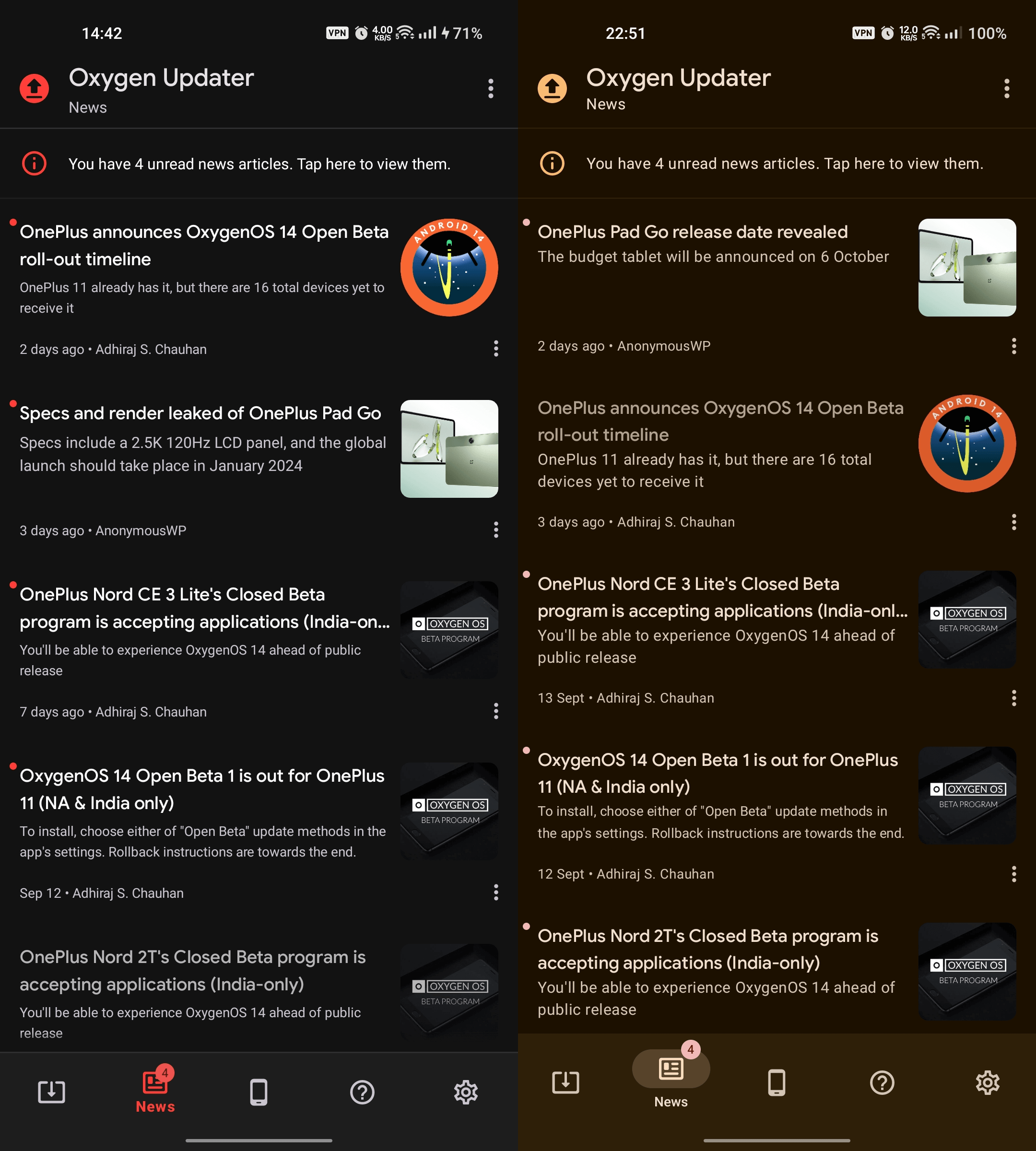
- News list screen (2nd bottom bar icon)
- Articles are now ordered by most-recent first, instead of creation order as it was before. This has been requested by a lot of our users.
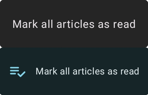
- Mark all read menu now has a leading icon within the same space:
(top: old; bottom: new) - Individual item menus now open in-place, instead of a full sheet at the bottom. This occupies ~68% less space and improves accessibility:
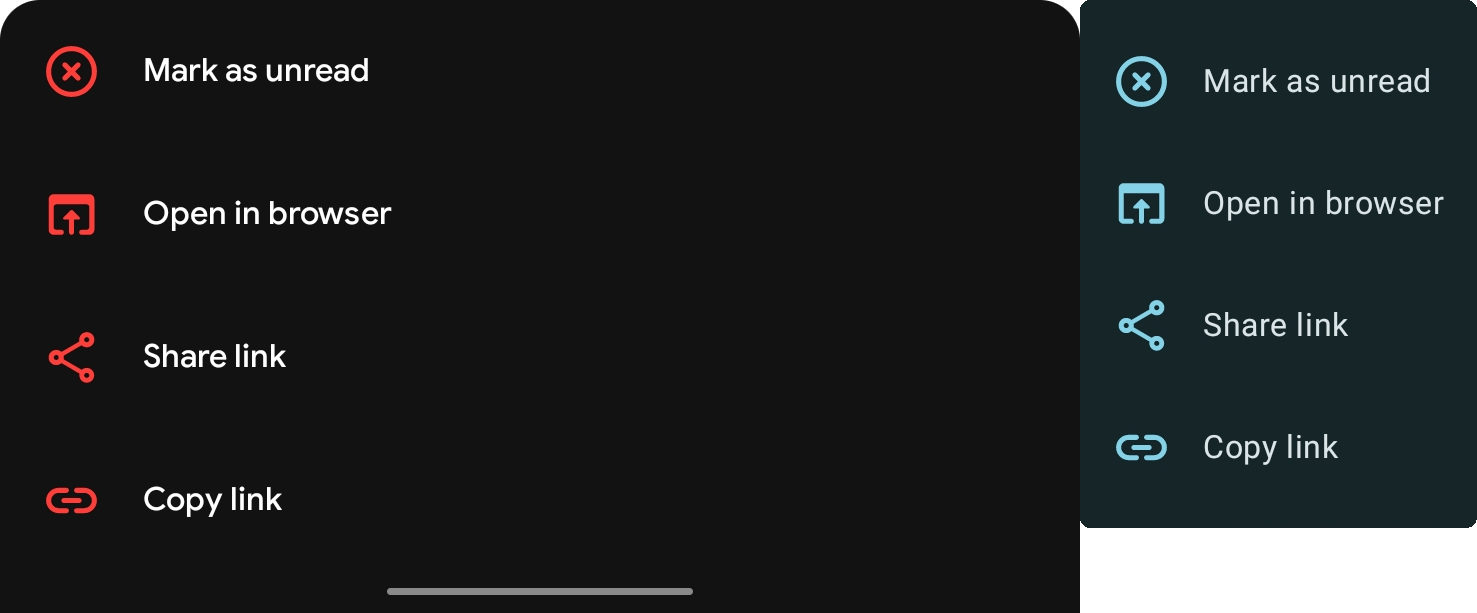
(left: old; right: new)
- News item screen (2nd bottom bar icon, then tap on an item)
- Articles can now be refreshed via the pull-to-refresh gesture.
- Fixed the double/blurred first line in the collapsible title section.
- If an article title is too long to fit in the collapsible section, you can now long-press to see it fully, as a tooltip.
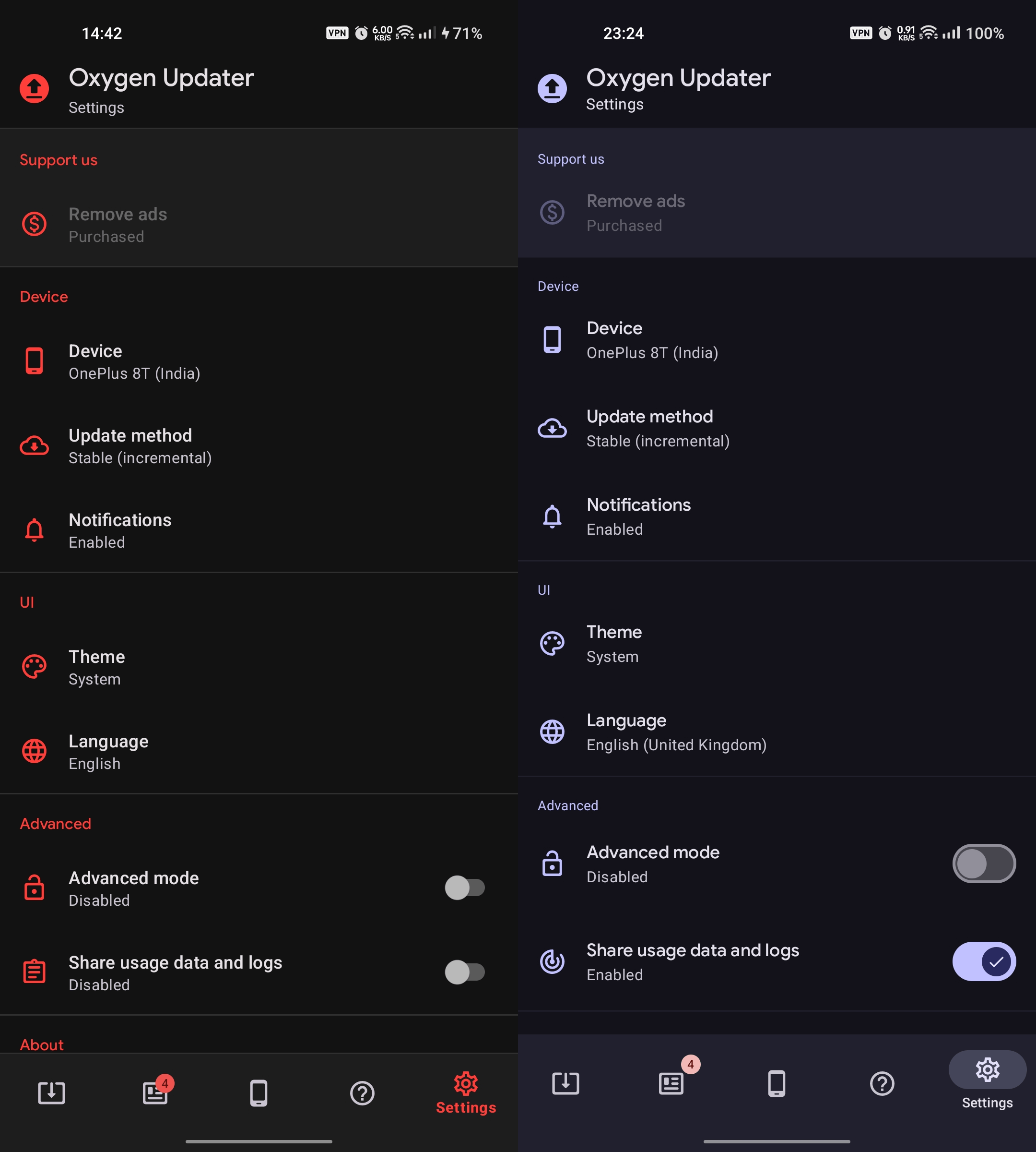
- Settings screen (last bottom bar icon)
- Device/method selection in the Settings screen of the app now auto-scrolls to the selected item, if any. Previously, auto-scroll-to-selected was implemented only in the onboarding/first-launch UI.
- Additionally, there is now a new "recommended" icon that shows what the app thinks your selection should be. This helps in cases where you change selection by mistake and want to revert it to the default/recommended one.
- Explanation text in the Advanced mode dialog has been updated for clarity. Hopefully, now there won't be as many people who'd get confused and enable it without understanding.
- The app now no longer needs to restart when device configurations have changed (e.g. screen orientation/size, system theme, etc.)
- For example, if you've selected the System theme in the app's settings, and you toggle Dark mode in your quick settings shade, you'll be able to see the app react to this change on-the-fly, without losing its state.
- Improved text legibility & accessibility throughout the app
- Colours, contrast, weights, etc. have been adjusted.
- Use non-linear font-scaling on all Android versions, not just 14/U.
- List items now soft-wrap by offsetting against the bullet symbol, which makes it clear which item a particular text belongs to.
- Improved edge-to-edge behaviour: nav bar now draws over content
- Bumped target SDK from 31 (Android 12/S) to 34 (Android 14/U), which means now the app no longer runs in "compatibility mode"
- There may be other improvements, so try it out and let us know what you think of it. We'll be looking out for your thoughts on this brand-new release.
What's been removed:
- The ability to swipe between different screens in the app (e.g. Update > News or Settings > About)
- This is mostly because the previous behaviour is discouraged by the Material spec.
- You now have only one option: tap on the icons in the bottom sheet if you want to navigate to them.
- The ability to long-press an item in the News screen to show a contextual menu
- This menu has always had 4 options: Mark as read/unread, Open in browser, Share link, Copy link.
- Those still remain, however now you can open this menu only by tapping on the overflow/3-dot icon below the image.
- The Help button in the About screen of the app
- This has had outdated content in it for quite some time, but we never realised it until now.
- It has been replaced with the Install guide button instead, which has the added benefit of allowing you to access our new & improved guides whenever you want, instead of only after a download completes.
(top: old; bottom: new)
- Some subtle transitions when opening/closing items into new screens. We hope to bring this back in future releases.
Screenshot comparisons
Onboarding/first-launch screen
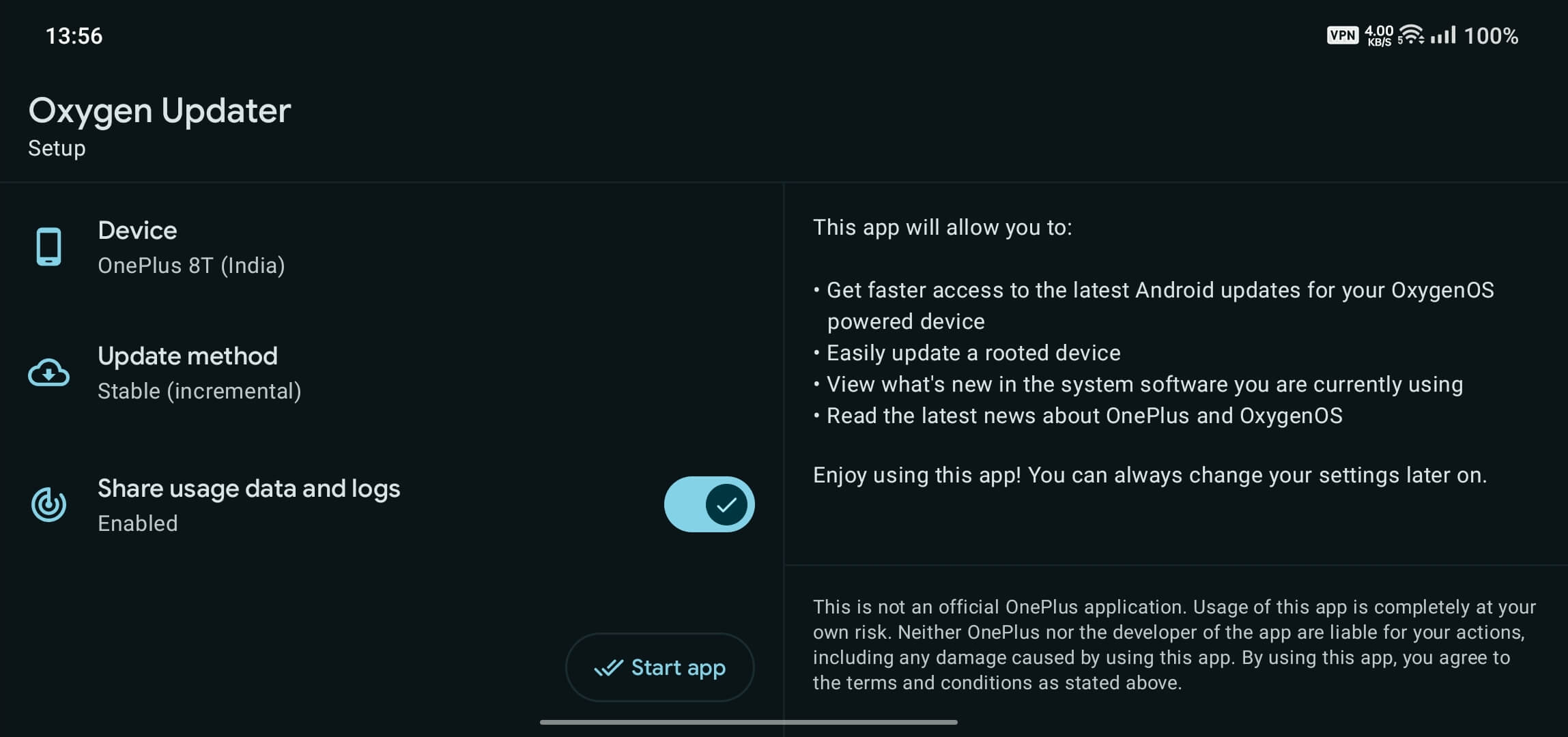
Such screens have a singular purpose: setup required preferences and allow the user to change them if they wish. It needs to be quick, unobtrusive, and should respect users' time.
In v5.11.3 and before, everything was needlessly divided into different screens, which forced required the user to do more work, thus wasting their time:
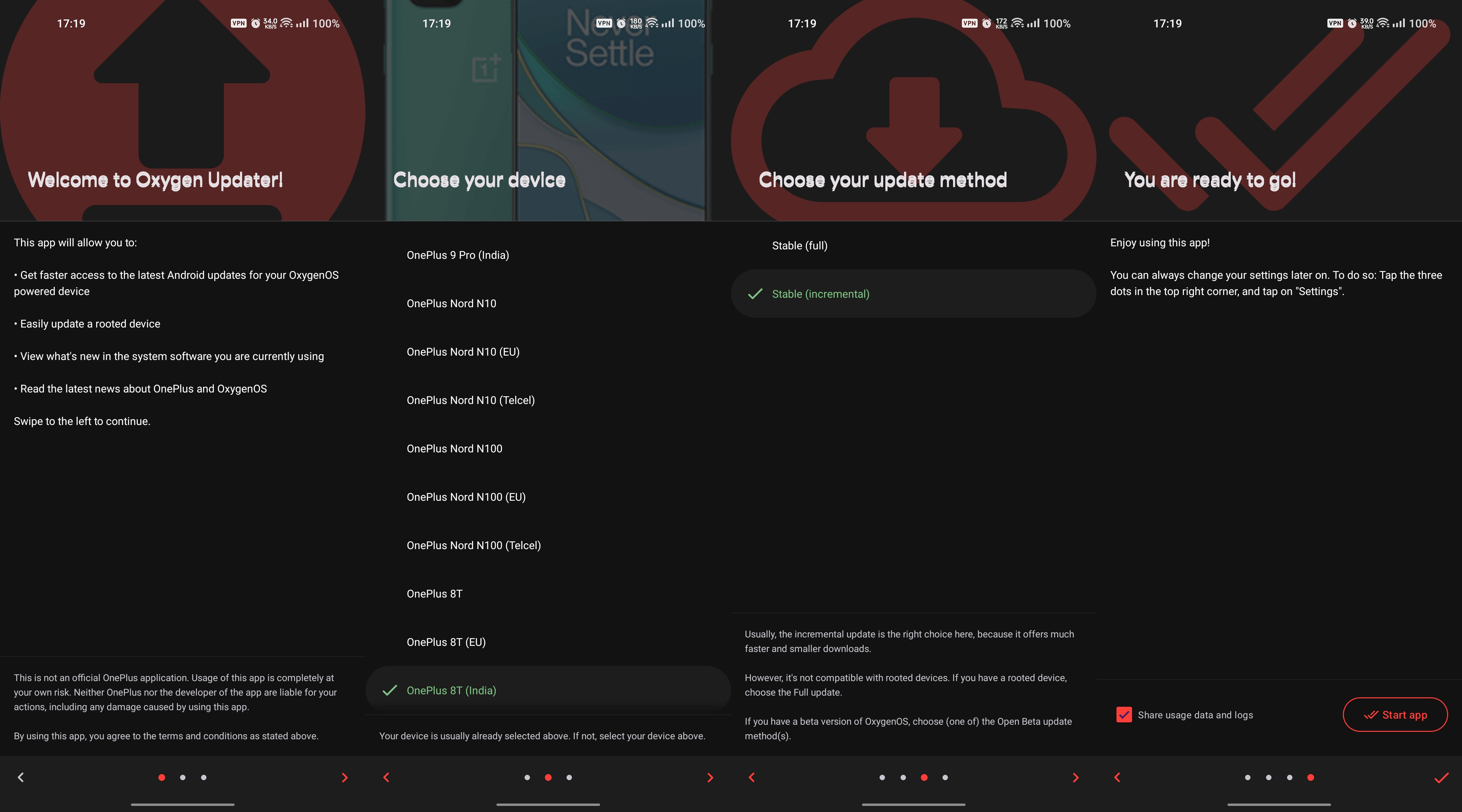
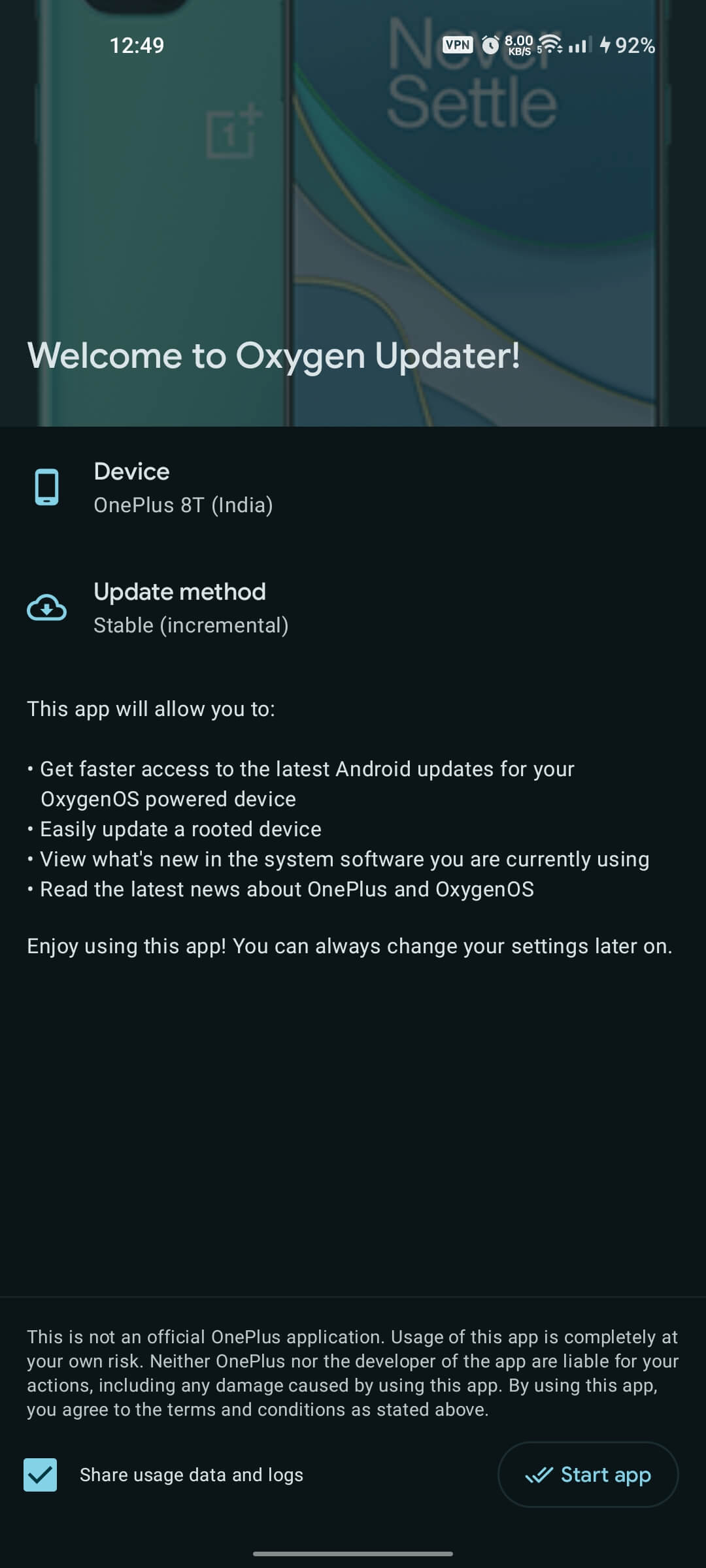
Now, in v6, we've simplified it to fit in just 1 screen. The app auto-selects the detected device/method, same as before, and users can tap each item if they wish to change any selection. No more wasted time, and it also is consistent with the Settings screen.
Update screen
Left is v5.11.3, right is v6. First thing you may have noticed is that all colours in the following v6 screenshot are different from what you see above. This is to exemplify Material You/Monet dynamic palettes, based on device wallpaper. I currently have a dynamic wallpaper that changes throughout the day; orange-ish at dawn/dusk, purple at night, blue at noon, etc.
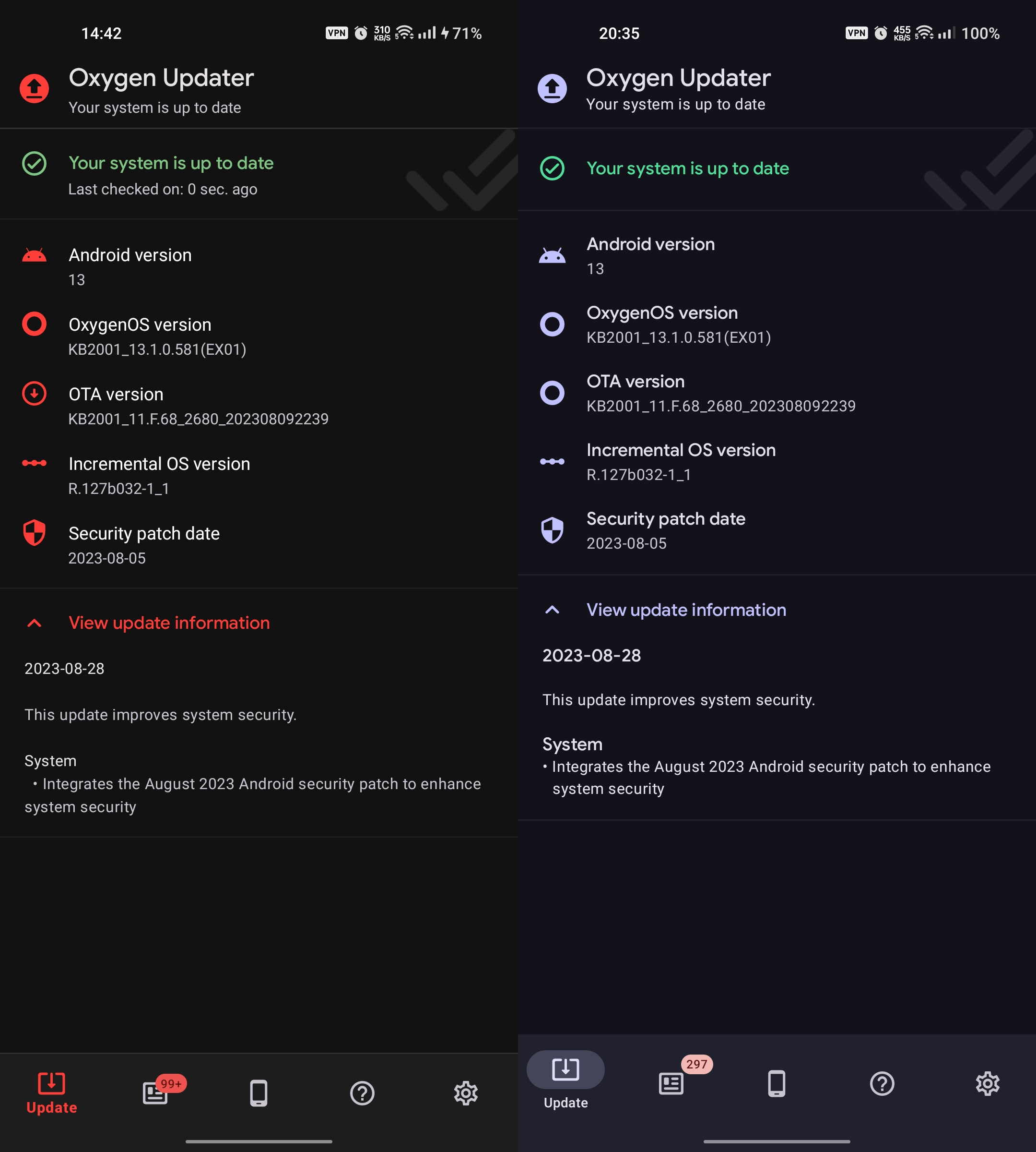
There are other things to notice:
- Headings in changelog text are more prominent now, making it especially helpful with longer changelogs.
- Additionally, you can see how list items soft-wrap within their own bounds, an accessibility improvement that was summarized in the previous section.
- News icon's unread count badge is now more specific; doesn't cap out at 99.
News screen
Settings screen
Other screens haven't changed much, so in the interest of keeping this article as short as possible, we're skipping those. Hopefully it was informative enough to give you a good idea what v6 brings to the table. It was fun working on this, so let us know what you think of it!
As a reminder, right now it's available only to our Patreon subscribers, so consider becoming one. Don't worry though, eventually we will release it as an Open Beta on Play Store (free of charge of course). After that final round of public testing, we will promote it to stable.
Thank you for your time!